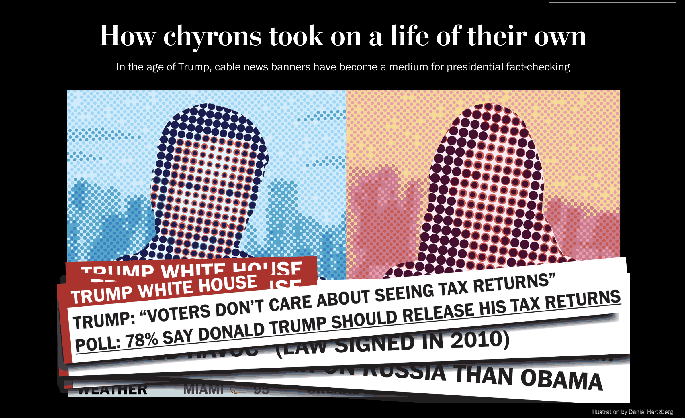
When I first began this assignment, I ran into the challenge of the visuals looking the same – a tv screengrab of Trump and a chyron on the bottom. In addition, I personally felt that putting screen grabs in the story did not drive home the point of the incessant “voice” chyrons uphold in the Trump age.
I distinctly remember sitting in the meeting and saying, “Well what if we put our own chyrons on the page, and have them pull the readers attention away from the story.” It was a bold thing to say, especially with the reporter in the room, but everyone did their “hmms” and “interestings”, and that is when I knew that if I could pull it off, it could actually happen.
This story challenged me to really think of the reader’s experience – and then go completely against it. Instead of asking, “what will keep the reader engaged in the story,” I thought, “how can I distract the reader and really get this point across.” It was an interactive element that I was excited to see work out and end up in the story. This piece was also special because I got to work with a freelance illustrator and do the art direction for the main image. It truly felt like a start to finish piece, and I even received my first fan mail and hate mail from it!
Super fun design by @madisonlynwalls on this @farhip story about TV news chyrons https://t.co/LBQrxjBuas pic.twitter.com/tD0M5q99YX
— ☕🦊 (@joemfox) July 31, 2018
What a wonderfully written, designed, and animated piece by @washingtonpost team of @farhip, @madisonlynwalls, and @danielhertzberghttps://t.co/gHv76d50Mt
— Sagar Doshi (@doshisagar) August 1, 2018


