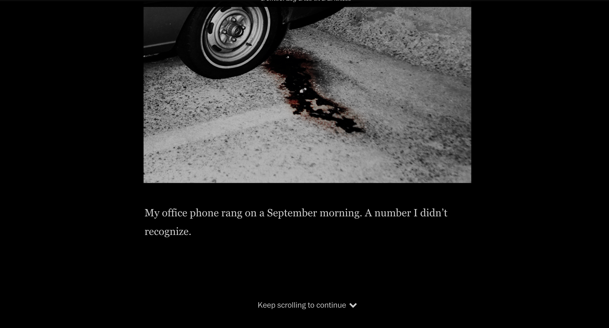
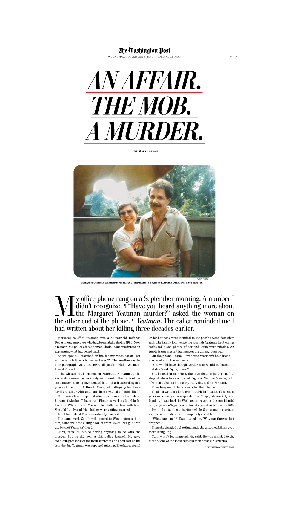
Most recently, I designed the riveting investigative story by Mary Jordan about a murder from the 80’s. After meeting about the story and going over all the content I had to work with, I knew that this design needed to be striking and different, almost cinematic in a way. The story is big. And everyone else agreed, which is why it got a special design treatment for desktop and mobile, a special version for apple news, a special section in the bonus day paper, and its own podcast.
While I can’t take credit for the podcast, I did get to play around with the digital and print experiences. It went from a brainstorming style board that was borderline cheesy to a dramatic and dark scroll experience.
I did take a big risk in this project. I assumed that my readers would be okay with an untraditional set up. No headline right off the bat – just the first line of text. In addition, I had to make sure they knew to continue scrolling when they got to the first screen.
I also had to think about how long the story is, and what would make people want to keep reading. That is why I put a side navigation in the desktop version, and a progress bar for mobile. I thought it was important to tease the reader with what is to come in the hopes that if they knew “the body” or “the prime suspect” section was up next, that would keep them reading just that little bit further.
From this page, you can visit the web version, the print version and the apple news version (if you are on an iOS device).
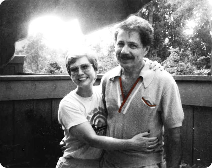
Story summary: ATF agent Artie Cunn was leading what police called a ‘double life.’ Then his girlfriend turned up dead. Cunn denied any role in the 1986 slaying, and no arrests were ever made. The victim’s family never stopped wondering why. Cunn, they eventually learned, wasn’t just married. He was married to the mob.


