Project Summary: Several studies predict more than a third of the world’s population will live in Africa by 2100. The Washington Post decided to explore what some of Africa’s cities already looked like in 2021 and the challenges they face with a growing population.
With stellar reporting from Max Bearak, we meet dynamic characters from 5 locations who describe life in these urban areas along with the hopes and fears they have for their home’s future.
Story Page Design: This coverage was originally pitched as a series of five individual stories. I quickly realized that the stories had more impact together than they did apart and suggested we keep them all on one page with multiple navigational opportunities for our readers to explore these stories as a package rather than as separate URLs.
Once the structure was set and the visual assets were in, I laid out a prototype using Adobe XD.
This is how we decided to structure the page as a funnel. Starting with the 30,000 foot view of the world and how the scale of cities will change in the next century then zooming into Africa and the impact across the continent, before going into the homes of some of the people directly impacted.
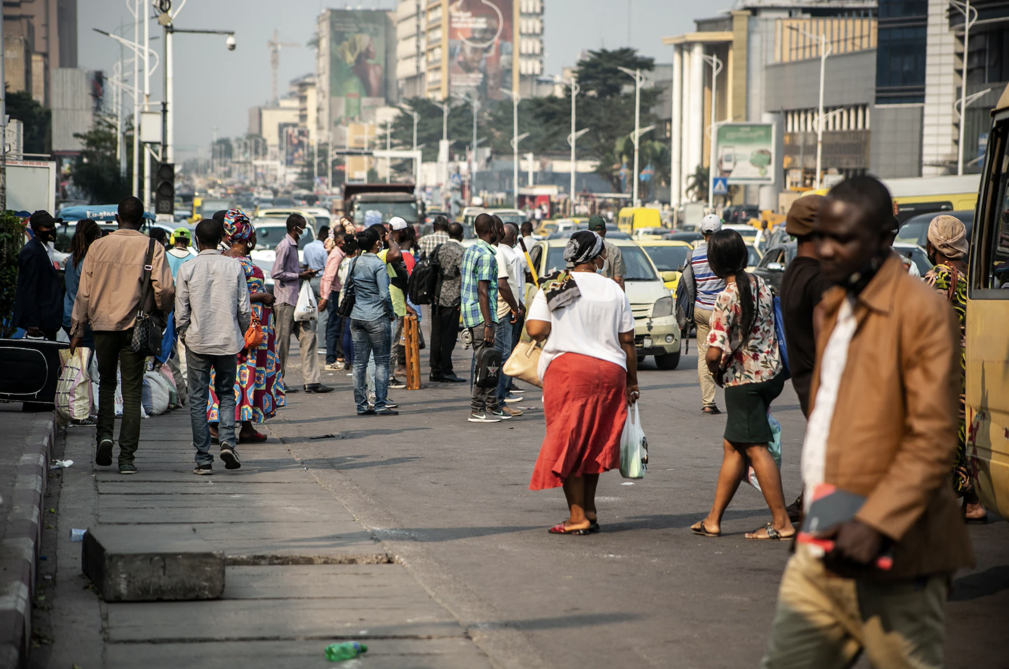
Visual Design: The photos and videos were breathtaking and put the reader in the center of these cities.
For the design, I decided to lean on the idea of “stacking” visuals to replicate the building and growth that is occurring in Africa. You’ll notice some photo packages surround a section of text on desktop, or diptychs that look like Tetris pieces waiting to fall into place. I also doubled-down on this style in the topper where you see the photos layering as you scroll. This was all to surround the reader in the experience.
We also got incredible GoPro video from some of the cities. I placed these as full-width looping videos to add to the pace and bustling energy of the locations.
Lastly, I added opportunities for the characters quotes to stand out. This was crucial in a story that is so graphic and data heavy. Bringing all the numbers and maps back to the people impacted allowed the reader to connect with these characters in a way that data cannot do.
UX Design: As with any story that is lengthy, I found it important to give the reader visual cues of their progress. I set up an interactive internal navigation that featured a progress bar for the readers to use as needed.
I also added multiple scrolling experiences that allowed maps and graphics to animate as the reader progressed. This provided a way for readers to read annotations about the map or graphic they were seeing.
Development: I coded this project using React.JS, HTML and CSS.