WRAL is a local news station based in Raleigh, North Carolina. It provides information on the latest Raleigh area news, weather forecasts, traffic patterns, ACC and high school sports, and more. Five UNC Chapel Hill students from the Usability and UX Design class led by Associate Professor Laura Ruel conducted usability testing on the WRAL mobile site. The goal of the project was to identify problems concerning prioritization of information on the mobile app and offer the developers suggestions for improvement.
The study process (see Methodology section) was standardized across participants; it included a pre-test questionnaire to assess current user habits, a free observation period to examine user behaviors, and a series of nine tasks based on scenarios relating to content exploration. Following the test, participants were asked to complete a post-test questionnaire in which they provided general feedback on their experiences with the app.
Limitations of Research
The major limitation of this usability study is the size of the sample population. With only eight participants, this study does not fully represent the WRAL demographic. A future study should consider having at least 100 participants from varying demographics.
Six of the eight participants were college students who are not within WRAL’s age demographic. This will not take away from the results, but it will not fully reflect how most of WRAL’s audience would respond to the app. If WRAL wants to solely focus on redesigning the app for its demographic, then a future study should incorporate more participants in the age range of its demographic.
Only two participants follow the local news daily, so this pool of participants do not engage with local news, which is most of WRAL’s content. This can be a factor in how the participant consumed the media (e.g., whether they found the content easily or understood where to find news topics)
Another factor is that each test was done separately by four students. This increases the likelihood of inconsistencies among the tests. Minor changes in the script and different times and locations of the tests could also cause some inconsistencies in the tests.
Methodology
Detailed descriptions of each step of the methodology are located in the PDF version of this study.
Participant Profiles:
A total of eight users participated in this study. Each moderator conducted two usability tests for the WRAL News App. In the study population, 75% of participants were familiar with WRAL news, but they had never used the news app before.
Typical Participant Demographic: College Educated Females
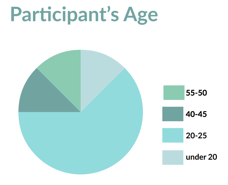
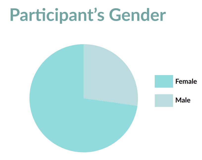
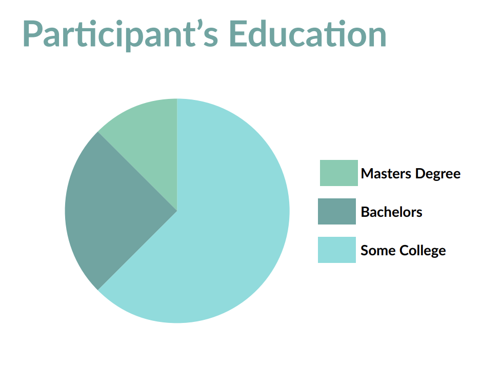
62% of our participants were college students. 63% were female and 37% were male. Most participants were between 20-25 years of age, and a few were above 40 years old. Nearly all of our participants were either enrolled in college or had completed a Bachelor’s degree.
Typical Participant Internet Usage: Mid and High Level of Internet Usage
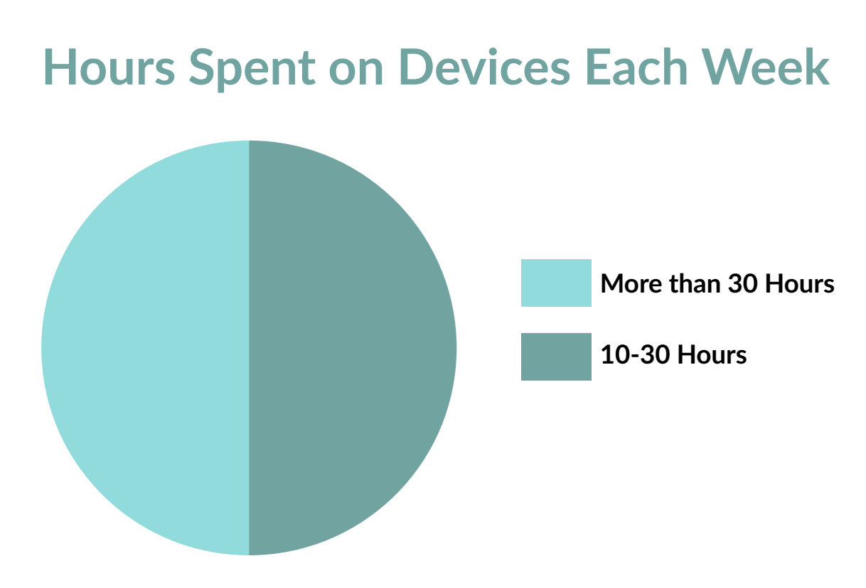
Half of the participants use the internet between 10-30 hours each week, and half use it for more than 30 hours each week.
Typical Participant Reading News Time: Less than 2 hours.
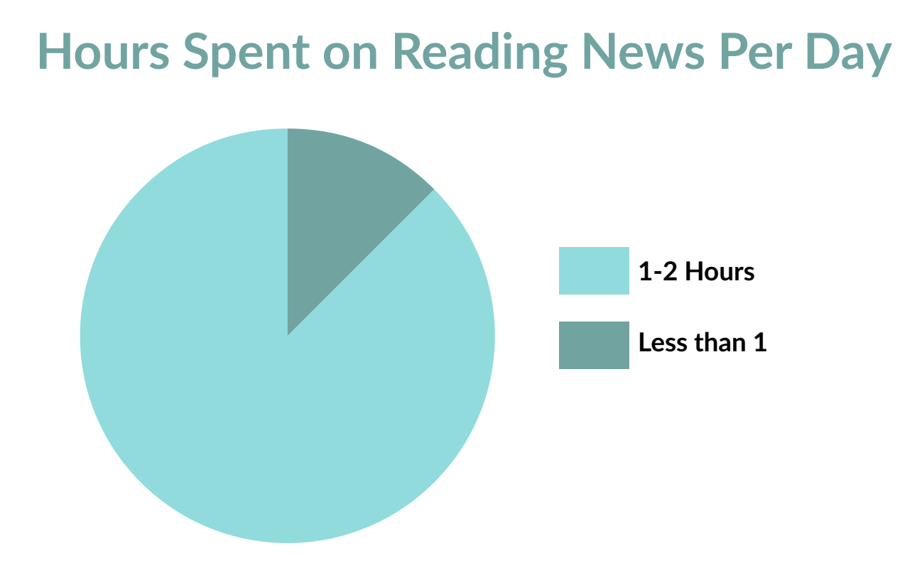
87.5% of participants spend 1-2 hours reading the news every day. The rest of participants read the news for less than 1 hour each day. This reveals that our study population spends a moderate amount of time reading the news each day.
Typical Source of News: Mobile App and Web Browsers
We see that most of our participants get their news from mobile apps and web browsers. Radio and podcasts are the second favorite type of news source in the study population.
Typical News Content Type: Articles
In the college educated female demographic, most of the participants like to read articles, followed by videos, podcasts, and photos.
An example of a positive, minor, major and catastrophic finding is shown below. For the full list of all the findings, please view the PDF.
Positive Findings
The Homepage Weather Tool
A significant portion of our users found that the weather section featured on the homepage was a very convenient and useful asset. They were pleased with the fact that they were able to check the weather quickly as soon as the app was opened. Therefore, they did not have to immediately delve deeper into the application for a quick update on the daily forecast.

Minor Problems
Hierarchy of Content
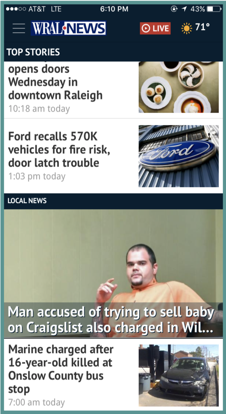
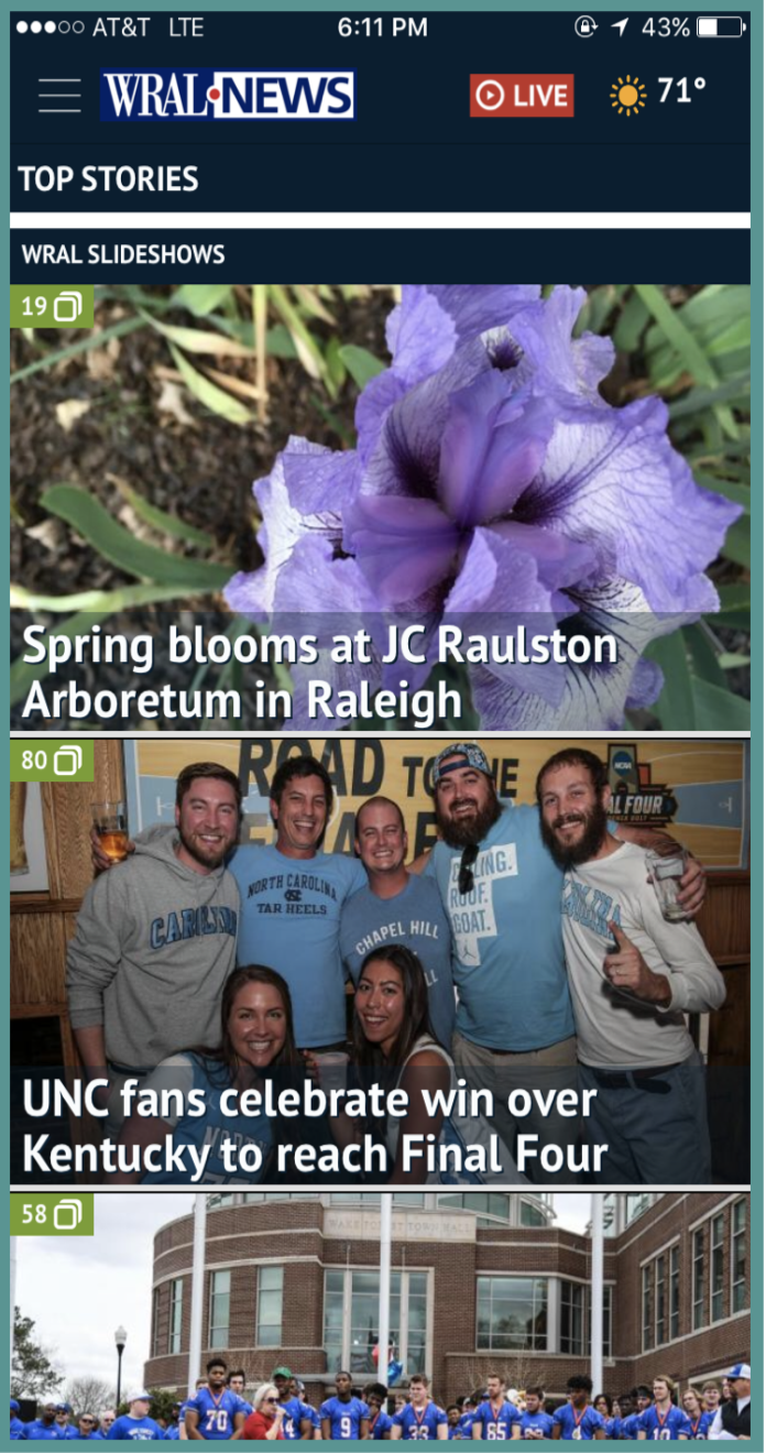
Our users found that the layout of stories presented on the homepage of the application was a bit inconsistent. Initially, most of the stories have the same layout with the description of the story on the left and a corresponding image on the right.
However, every now and then a story with a full-width image with a headline overlaying the bottom of the image would show up which was stylistically incohesive.
In addition, our users found that they had to scroll for quite some time before they reached a section of videos that the user could watch.
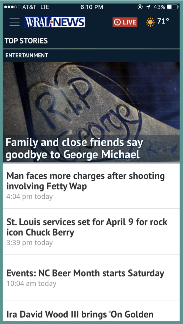
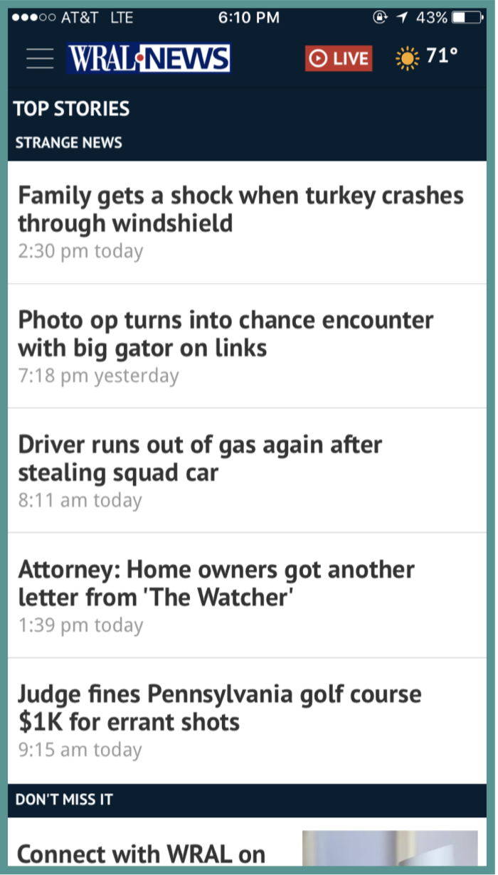
Below that, the user reaches a portion with stories about entertainment, most of which are solely headlines and as the user scrolls past that, they reach the “Strange News” category which is modeled after the entertainment section.
Finally, the homepage concludes with a “Don’t Miss It” category which follows the traditional description on the left, the image on the right layout and at the very end, they reach the slideshows which WRAL has recently posted.
Recommendations:
Put the most important content on the homepage. If most users look at local news stories on the app, then put the most recent local news stories on the main page. However, do not put too many stories on the homepage. Show the users the top ten to fifteen news stories on the homepage. Also, stick to one layout for the stories on the homepage. It is important to be consistent, so users do not get confused.
Major Problems
Search Functionality
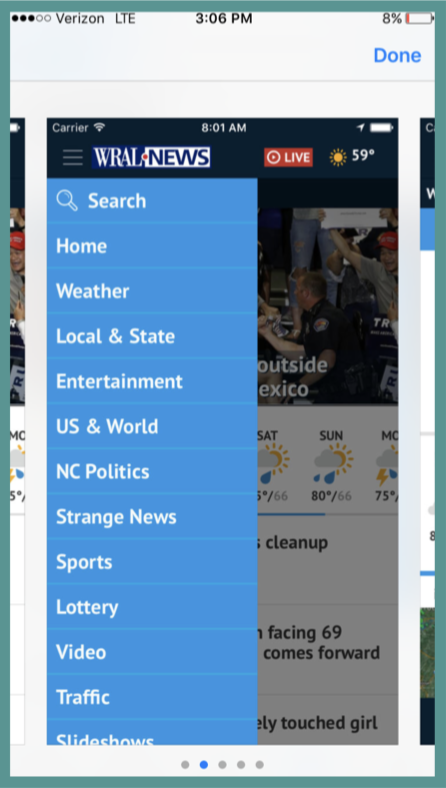
The majority of users experienced difficulty finding specific content. When they were asked to find an article about the immigration ban, instead of using the search bar, they clicked into “NC Politics” or “US & World” sections in the hamburger menu. Many expressed expecting to find a search bar in the top navigation bar of the app (”I would never think to look for a search bar in the menu!”)
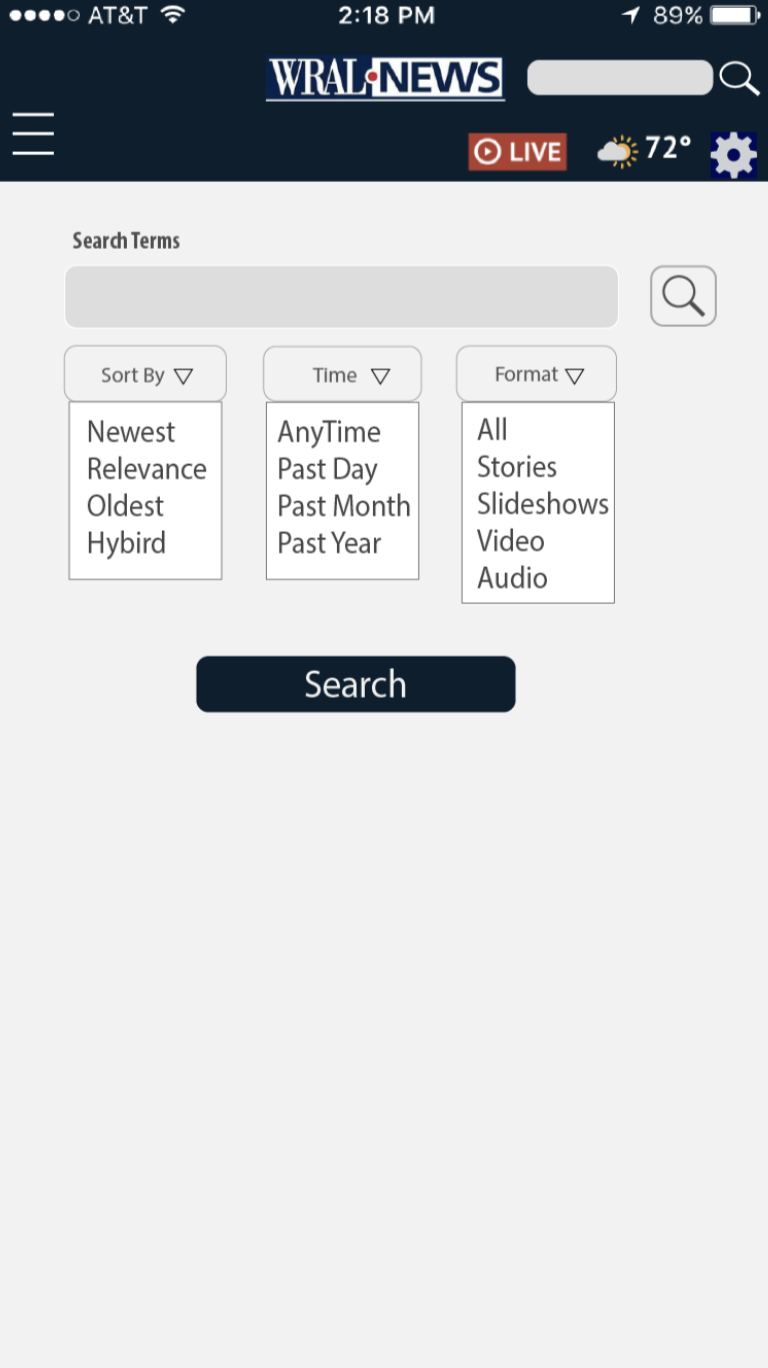
Furthermore when users searched for keywords in the search bar, the search results were not followed by content that they were expecting. They also expressed confusion with the specification of the search feature (”This looks like an advanced search option, but I didn’t want an advanced search.”).
Lastly, users commented that the search bar looked like a section topic at first glance. Moreover, many commented that the search bar tab has no contrast with its surroundings.
Recommendations
• Placing search bar to the header or homepage, the place that easily helps the user to navigate and easily provide search for user anywhere anytime.
• Redesigning the settings and giving common names such as “Time”, “News Type” to the settings for the search bar.
• Giving contrast to the search button and the cancel button in the drop-down list.
Catastrophic Problems
Planning a Route according to Traffic
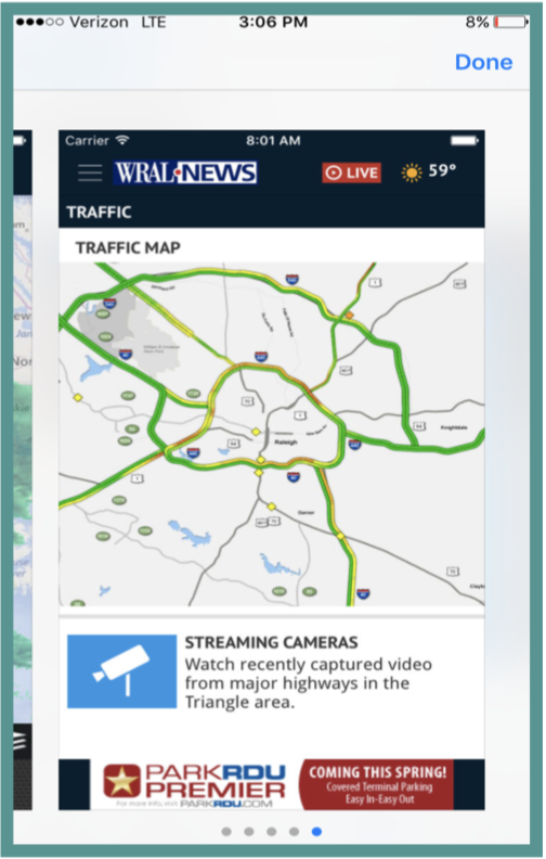
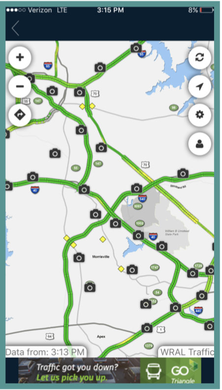
Participants were tasked to use the app to check local traffic patterns and plan their route to work accordingly. If participants did not have a work address, they were asked to use another local address and route from their current location.
All participants easily succeeded in finding the traffic feature (listed in the left navigation bar) and launching it (by clicking the map on the middle screen below). However, once the page opened, participants could not figure out how to use the traffic map. Only two users clicked to the page with instructions on how to plan a route (indicated by the diamond/arrow icon). The ones who did not haphazardly dropped pins and attempted to move them around to create start and end points. Four out of our six users could not complete the task due to frustration with the site.
Recommendations
If you want to keep the traffic map, the feature to plan a route needs to be clearer for the users. When users get to the map, there needs to be text or icon that will instruct users to the feature. Then within the route planning feature, for a user’s first time, the app should walk the user through it, to show the user what he or she can do.

